Kathyglennstudios
  • Home
  • Artist Statement and Bio
  • kmsGlenn blog
  • Daily Paintings
  • Gallery
  • TeddyRBoston Bags
  • Confident Color Class
  • Looking back
  • Daily Paintings
  • Confident Color Class

A New Contrast.

9/15/2016

0 Comments


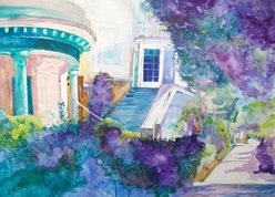
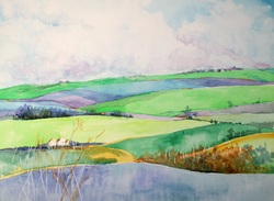
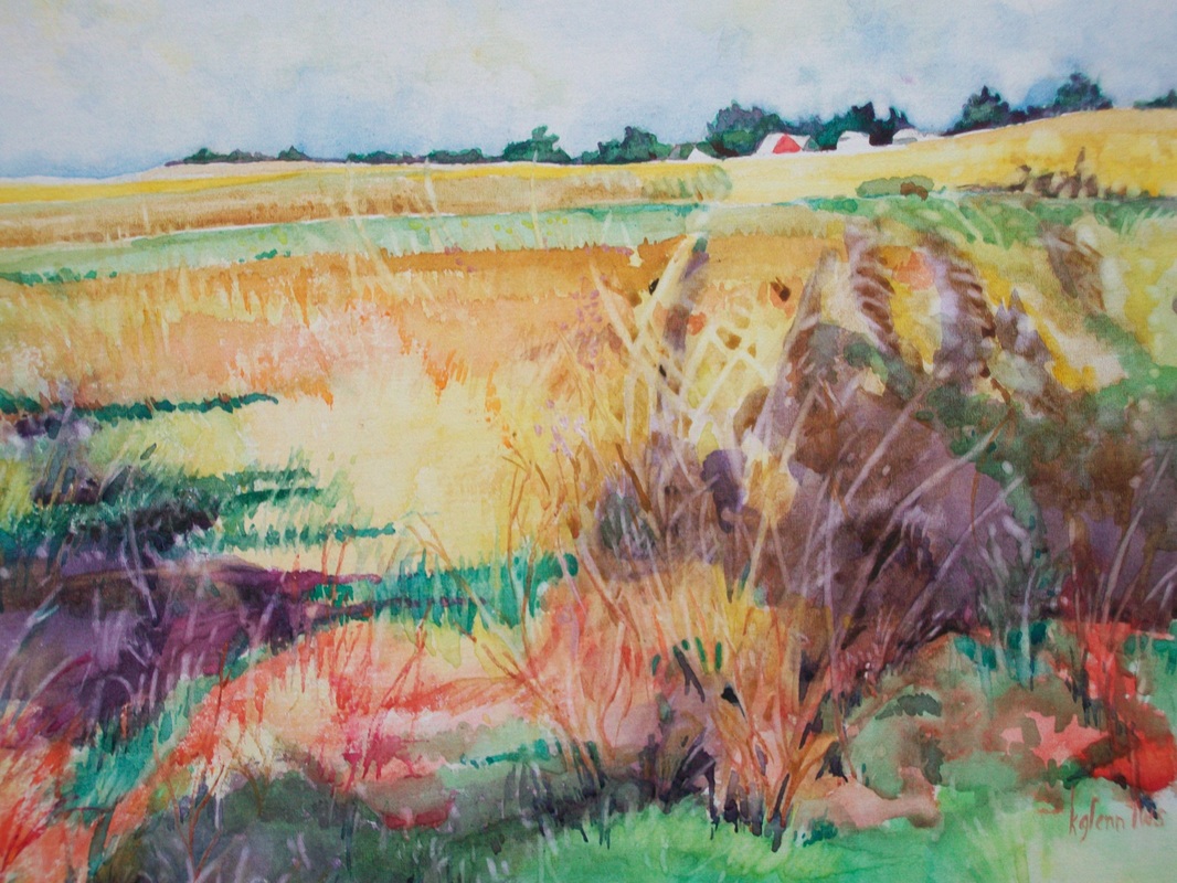
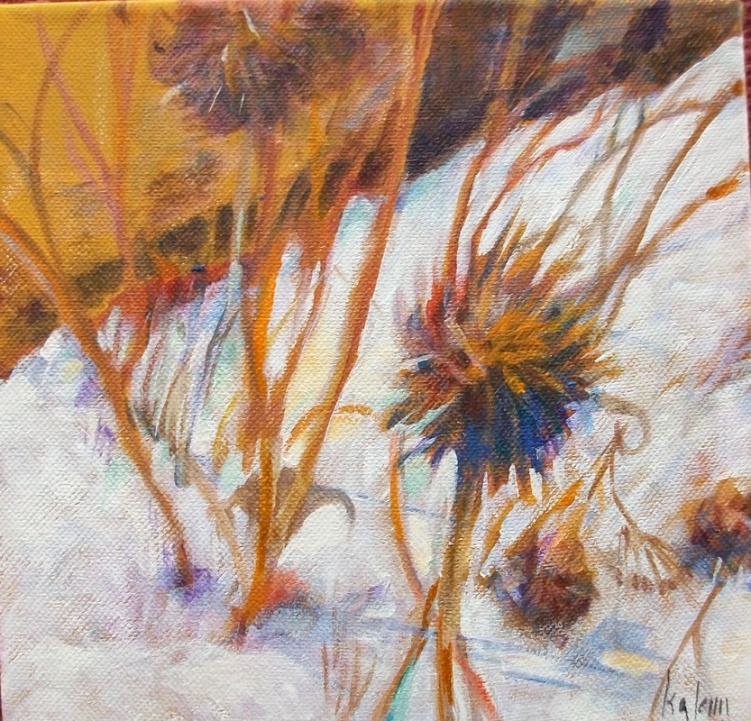
One of the most important tools an artist can use to make a painting interesting is the use of contrasts.  Such things as light versus dark, straight lines against curves, textured against smooth and, of course, complementary colors.

But in recent years, we are able to use the contrast of transparency versus opacity.    At one time it was considered a nono to add an opaque color to a transparent watercolor.  In fact, some major watercolor societies still adhere to the rule of using only transparent watercolor.  

I'm not sure who was the first to break this 'rule' but I do know the first I was introduced to the concept was in a workshop with Stephen Quiller.  He worked in watercolor media, including traditional transparent, casein, acrylic and gouache - often in the same painting.  

A watercolorist in the past might have used a white gouache to correct a mistake and then paint over with a watercolor.  What happened?  Well, the eye immediately went right to the correction.  It was the mark of inexperience.  

So what happens when the painter uses contrast in a composition? The eye is directed to that spot. You know, the  bright spot of red on a flower next to green florals. Or, the shaft of sun creating the lightest light in a dark still life.  

And somewhere along the line, someone discovered that the eye could be led to the point of interest or create interest in contrasting opaque with transparency.

And this is one of the things we are going to be discovering by using transparent paints and gouache.  And, oh yes, we will be exploring more color along with this.  And, of course, we will have fun experimenting!


0 Comments

The Rules from A to Z

7/12/2016

0 Comments

 
"Just tell us the Rules from A to Z".  
That was from one of my students in an intermediate/advanced class.

So I thought this might be a good time to talk about how you might work your way through the process of learning to paint with watercolor.

​Beginning Watercolor:
This is the place to get a firm foundation on what are the properties of watercolor and get your feet wet trying some things.  This includes learning to have some expectation of what your materials will do for you.

At this point you will have a lot of 'head knowledge' that can be given to you from an instructor or source.   
You will need to know a vocabulary so you can understand what is being said.  These might include such things as 'transparency', 'luminosity', 'hue', and so on.  Just as if you were in the medical field you would need a vocabulary so the same holds true in art.  You need information on what types of paper, brushes, paints will be best to achieve the effect you desire.  Needless to say, this takes time.  Don't expect to learn everything in a 6 week class.  That said, a short class is a great way to get your feet wet and see if this is something you might want to continue.  

You might call this phase "Rules from A to F?'

There are many ways you can receive this information.  Perhaps the easiest is through direct instruction, either in  group or private lessons.
But you also have at your fingertips tons of information in books, internet instructors, and demonstrations.  The resources available range from introductory to advanced.  

And the speed at which you mature to the next step will be in direct proportion to how much time you are willing to spend - how much time you spend putting the brush to paper.  You can read books, listen to discussions and watch demonstrations but the artist who spends time painting will always advance more rapidly than those who just know the rules.


Intermediate and Advanced:
At an intermediate level, the watercolor student will continue to improve technique until it is mastered.  Some may stay in this technique for the rest of their painting life.  So they may become advanced in that one area.
​
But the truly advanced are confident that they may experiment, play, and enter into the spontaneous nature of the paint - and that is the joy of watercolor.
​
0 Comments

A word about 'modern' color

6/20/2016

0 Comments


We are truly fortunate to be painting at this time.  Not only do we not have to mix our own pigments but we are being offered fantastic new paints in every catalogue that comes out.  Where once we might have worked with a primary triad of red, yellow and blue we now are offered such colors as quinacridone magenta, transparent yellow and cyan.  This is a palette that is safe if you wish to have your artwork printed because the colors are nearly the same as the inks used by printers.  Much more so than the traditional primary triad.

You'll find many new colors on manufacturer's charts at the art store or in their catalogues.  You will recognize them by their jawbreaker names:  anthraquinoid, thioindigo, indanthrone, and quinacridone.  

​A color index/ASTM Chart such as is found in Nita Leland's book, Confident Color is extremely helpful when you are choosing color.

But don't just take the chart at face value:  it is a starting point for you to start your exploration of color.  Try the paint for transparency, staining, and vibrancy.  You work as an individual different from others and you are the best judge of what will work for you and your way of working.
Picture
0 Comments

Value Sense?

6/12/2016

0 Comments


Now that we have a color/value wheel how does that translate to our painting?  How is it going to help us?  Don't we just see the value and add it to our painting?

The answer is no.  You are the artist and you should be manipulating colors and values to make a statement.  Ask yourself, why are you painting this scene if its just going to be like the one in your photograph?  Even if that photograph is a knock out.  Because if it is so great, why are you painting it and not just framing the photograph.  
​
I've told you it is alright to use the black/white feature on your camera or ipad to find the values in the painting as a shortcut.
That works if your photograph is value-balanced.   But if it isn't, you need to make a quick sketch to improve the composition and tell you where you want to use those values. And as an aside, you should be using your own photographs - the ones you took when you were so excited about the subject.

If you are an advanced watercolorist, you are ready to ask yourself lots of questions about what you are painting.   The highest form of expertise in any subject, really, is the ability to evaluate or critique your own work.  Some questions you might ask yourself:

Is my technique as strong as I would like?
Do I have a value sense?  
Do I understand balance and composition?
Do I know how to use color and value to create a mood?
What am I trying to say in my painting?

From my experience, just when you think you are 'advanced' or 'top of the line' is the time when you should be thinking of what to improve, change, or generally 'grow'. One of the great things about watercolor and art in general, is there is always room to grow!


0 Comments

"Beginning" Intermediate Watercolor

6/7/2016

0 Comments


About now most of you have been working in watercolor for at least a little bit.  And now you are ready to do a few extra things:
First: improve in technique
Second:  find your "voice" or style
Third:  Look ahead to creating work that satisfies you.  

Lets start with the last one, which we might also call, "what am I going to paint next!"  "Now that I've created a painting that I like, how can I find something else I'll like to paint?"  "I want to be Inspired!"
I recently read an article on Facebook from an anonymous artist to a young artist on how to be inspired.  And I thought it was such wise advice as well as something I had found in my own life as an artist.  That is, you don't wait for inspiratAion.  If you do it will be a long time coming.  There's been many long times between paintings while I waited for something that would excite me enough to paint.
Rather, just jump in.  Pick up the brush - everyday.  Even if just for a five minute period.  Set a time limit and make sure its on the top of your list that you're not going to go to bed that night if you haven't painted for those five minutes.  
Or give yourself a challenge that you will complete a painting every week for a year.  It doesn't matter what subject, just put brush to paper.  
And somewhere down the line your inspiration will kick in.  Something you painted will lead to a different way to look at subjects or give you an idea for the next and the next.  Ideas snowball when you are moving, not when you are sitting still trying to be creative.
​One of the most inspiration killing thoughts is "Now I'll do something creative."  


0 Comments

Intensity!!

2/14/2016

0 Comments

 
As you know by now, the most intense color is on the outside of the color wheel.    The primaries are Red, Yellow, and Blue and Secondaries are Orange, Green and Purple.  Mixing the colors across the color wheel, or the complements in equal parts will become gray.  
Mixing all three primary colors will also make gray.  
But mixing any color across the color wheel in uneven  parts will produce colors that are neutralized or naturalized.  
We very seldom see full on intensity in nature unless it has been altered, such as hybridized plants.  Lots of browns,
 grayed greens and rusty reds.  

But some tubes of paint are now being produced to create a higher intensity than a simple intense color.  New methods have increased our ability to make a bright splashy color.  
Today we're going to try a new 'modern' type of paint made by Golden, a manufacturer of acrylic paint and mediums.  The brand is QOR and we'll be using the HighChroma set. 

We'll also be looking at QOR Watercolor Ground.  This brand can be worked on in 24 to 72 hours while the Daniel Smith Watercolor Ground takes a full 72 hours to dry.

And the type of support we'll be using is aquabord by Ampersand.  This is an archival clayboard artists panel.  

0 Comments

A New Start

1/25/2016

0 Comments


​   No matter how long you have been painting, from beginner stage through advanced, it always helps to take a breath, relax, and calmly enter the basics of water
media.
   Of course, if this is your first try at watercolors, you will learn  about the materials and tools.  But even if you've been painting forever, there are many exciting things to try. The 'rules' are out the window and manufacturers have listened to practicing artists and introduced many new media, support, and brushes as well as exciting extras. Artists are experimenting and introducing concepts that are beyond what you may have learned as a beginner.
0 Comments

Color:  Intensity

9/28/2015

0 Comments

 
The term 'Intensity" refers to the brightness or dullness of a color.s

Color in its most intense form is found on the outside of the color wheel.  When other colors are mixed with it, they tend to 'gray' or 'neutralize'.  The further the addition is to the complementary color, the more it is dulled or neutralized.

One thing to be careful of is thinking that because a color is taken from a tube it will be in its most intense form. This isn't always the case.  Some tube colors are actually a combination of colors.   

A good exercise to find which of your colors are most intense is to take a sample of each tube of paint you own and place it on a color wheel you  make.  It will help you to see color as well as help you learn to handle your brush and the media.  Exercises will go a much longer way to your growth as an artist than simply painting a picture.  

So how do you use intensity in a painting?  Find the spot or area that you are most excited about - the point of interest.  This is what you are saying about the photograph that you are working with - you artist's statement:  "look at this!  How interesting this is"  This should be the most intense - some times even just a very small point of color will bring the viewer's eye to the spot.

When everything else in the painting is slightly to fully neutralized, that area will pop.  The more neutral the surrounding area is, the bigger the impact.

The question you will ask yourself as the artist is:  do I want to make this area really stand out or just slightly speak to the viewer?

A quick word about too much intensity:  You may wish to use all intense colors to make your statement.  In this case you will have to use composition to zero in on the point of interest.  And be sure you have a reason for high intensity beyond just liking the colors.


0 Comments

Color:  Hue

9/21/2015

0 Comments

 
Color has four properties.  We've discussed the first - value.
The others are Hue, Intensity, and Temperature.


We can use these properties to interpret or make a statement about the photograph that we are using.


Let's look at Hue.  This is the color name or its position on the spectrum - its wave length.  
This morning I was walking on a forested path.  Around me were trees and brush.  The flowers that were there earlier are now gone.  So, beyond the brown of the tree bark,  I saw a sea of green.  The forest's hue was green.   But that green was made up of many varying shades of green.


So if we are looking at a green area such as a lawn,  we can use color to cue the viewer to what we are saying.  For instance, we know that the length of that space is all the same green. That is the Local Color.   But, because of shade, light, distance and other factors, our eye interprets the lawn as differing shades of green.  In other words, the optical color.

You, as the artist, have the opportunity to alter the hues to make your statement.  To do that we'll be talking about optical light which uses temperature rather than local color.


0 Comments

Using Photographs as Reference

9/14/2015

0 Comments

 
Almost all of us take photographs to remember events or places that have meaning for us.  So how do we use those photographs?

We can simply enlarge and frame them.  We can use a photoshop approach to alter the original photograph, then enlarge and frame.  We might use them in photo books from online places such as Shutterfly.  

But what if we want to use them as reference for a painting?

First, we should ask ourselves, what is there about this photograph that inspires me to want to do a painting?  Why wouldn't I simply reproduce the photo?

I'm going to have you answer a few questions to get to the why.

1.  Where did I take this photograph?  Was the place meaningful or was something else in the picture that I found meaningful or interesting.

2.  What was I feeling at the time?  the Temperature?  Sadness or happiness? Awed by the beauty?  Something else?


3.  What, in particular was of the most interest to me, in the photograph?
Can I pinpoint the area that appealed to me?


Once we have established what the direction of your painting will be we can use tools at our disposal to share our observations with your viewer.
0 Comments
<<Previous
Forward>>
    Picture

    Author

    Kathy Glenn
    Art Center

    Picture
    Picture

    Archives

    April 2018
    March 2018
    June 2017
    February 2017
    January 2017
    December 2016
    October 2016
    September 2016
    July 2016
    June 2016
    February 2016
    January 2016
    September 2015
    July 2015
    June 2015
    January 2015
    December 2014
    November 2014
    October 2014
    September 2014
    June 2014
    April 2014
    March 2014
    February 2014
    January 2014
    November 2013
    October 2013
    September 2013
    June 2013
    January 2013
    October 2012
    September 2012
    April 2012
    February 2012
    January 2012
    December 2011
    November 2011
    October 2011
    September 2011
    August 2011
    July 2011

    Picture

    Categories

    All

    RSS Feed

Proudly powered by Weebly