This session we're going to be heavily focusing on color and what you, as the artist, can achieve by thinking out your color before you begin to paint.
But before we do that, let's review the four properties of color:
One: Hue - the color itself. For example all the blues are one 'hue'
Two: Temperature. Within the blue 'hue' are colors that are blue but are also warmer or cooler versions of the blue. A color's temperature is relative to the colors around it.
Three: Intensity - the most pure form of a color - found along the outside of the color wheel - is the most intense. As colors are mixed with other colors they become less intense or grayed, in proportion to where the added color is on the color wheel. The colors exactly opposite - the complement - will produce a gray when mixed in equal portions.
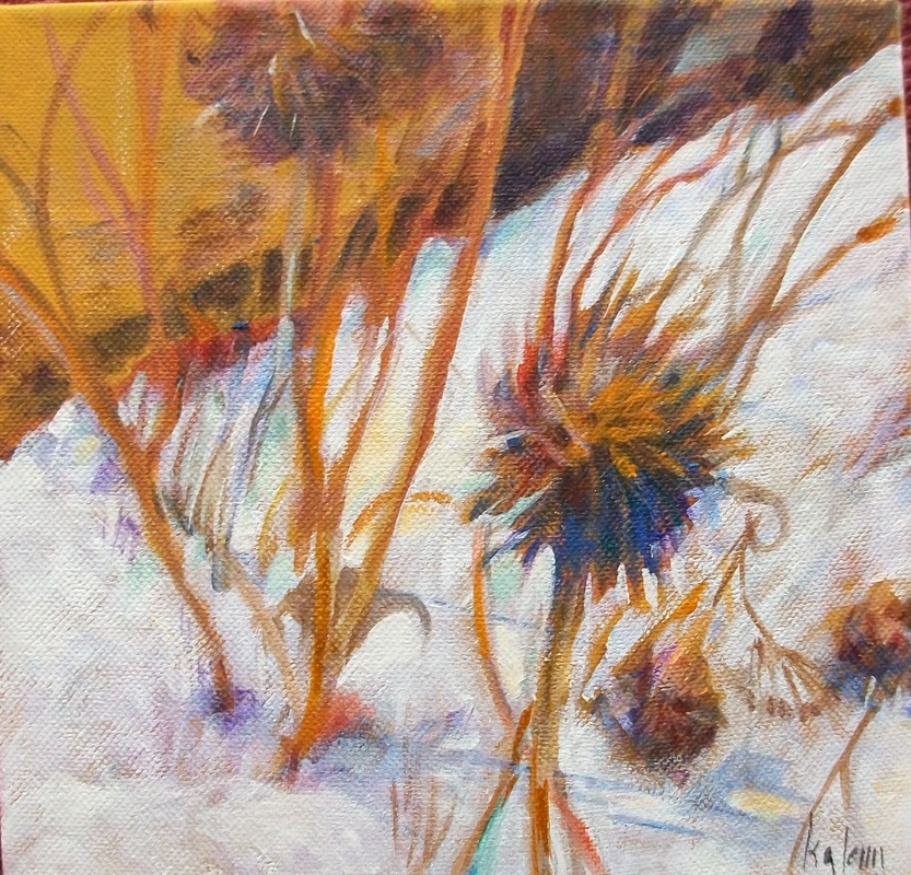
Four: Value - how dark or light the color is. Yellows are usually the lightest - or most high key - while purples are usually the darkest. If you are using a medium where you will be adding white, light values can be mixed.
So how will you use color to evoke a mood? or present an idea of what you have found memorable? Color will do that for you.
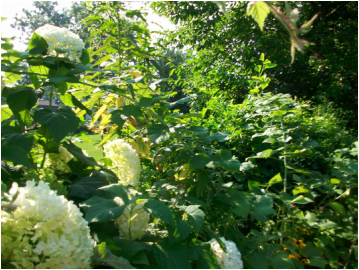
How will you show the heat of the desert? Using color. The cool spray of the ocean. Again color. How about something sad or somber? Or happy and light? Through the use of color.
As the artist, you will start to develop themes for your paintings. And these themes can be expressed using color. So, what is the best way to find out what colors will work for you? By experiment and discovery. And that's what we'll be working on.
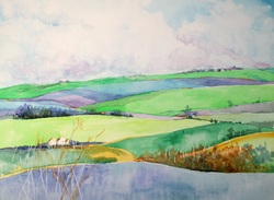
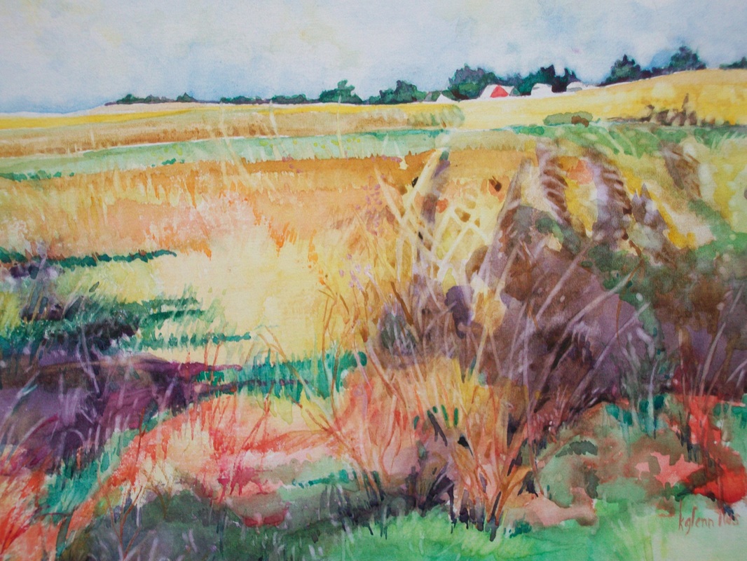
There are lots of tools in an artist's workbox. One of them is "The Color Scheme" and we'll be working with some of these. This week we'll be looking at the Monochromatic Scheme.
But before we do that, let's review the four properties of color:
One: Hue - the color itself. For example all the blues are one 'hue'
Two: Temperature. Within the blue 'hue' are colors that are blue but are also warmer or cooler versions of the blue. A color's temperature is relative to the colors around it.
Three: Intensity - the most pure form of a color - found along the outside of the color wheel - is the most intense. As colors are mixed with other colors they become less intense or grayed, in proportion to where the added color is on the color wheel. The colors exactly opposite - the complement - will produce a gray when mixed in equal portions.
Four: Value - how dark or light the color is. Yellows are usually the lightest - or most high key - while purples are usually the darkest. If you are using a medium where you will be adding white, light values can be mixed.
So how will you use color to evoke a mood? or present an idea of what you have found memorable? Color will do that for you.
How will you show the heat of the desert? Using color. The cool spray of the ocean. Again color. How about something sad or somber? Or happy and light? Through the use of color.
As the artist, you will start to develop themes for your paintings. And these themes can be expressed using color. So, what is the best way to find out what colors will work for you? By experiment and discovery. And that's what we'll be working on.
There are lots of tools in an artist's workbox. One of them is "The Color Scheme" and we'll be working with some of these. This week we'll be looking at the Monochromatic Scheme.
 RSS Feed