Kathyglennstudios
  • Home
  • Artist Statement and Bio
  • kmsGlenn blog
  • Daily Paintings
  • Gallery
  • TeddyRBoston Bags
  • Confident Color Class
  • Looking back
  • Daily Paintings
  • Confident Color Class

Triads:  Using a Limited Palette

3/31/2014

0 Comments

 
Picture
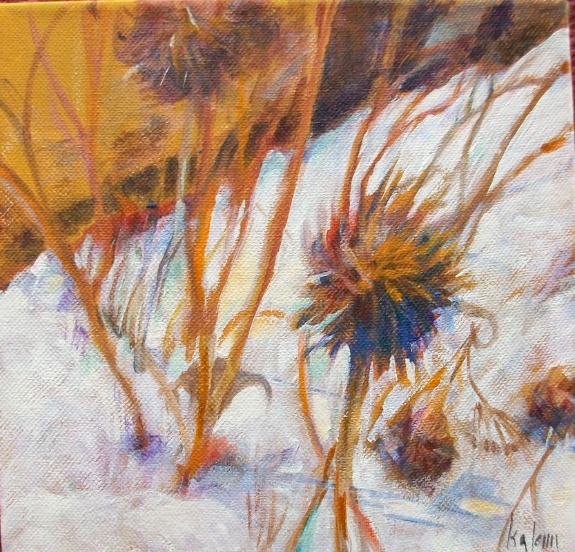
The term "triads" refers loosely to limiting your palette to a grouping of three colors.  Often these are derived from the use of some variation of the three primary colors.   A bold triad might use  three high intensity primaries.  An old masters might use burnt sienna, yellow ochre and payne's gray.  And a modern triad might include perylene maroon,  quinacridone gold and indanthrone blue.

Paint technology has made huge strides in producing colors once used only by commercial designers.  And new colors are being introduced every day.  You will see new ones every time you look at a new catalogue.  A 'modern' triad popular today is one where magenta, yellow and cyan are substituted for red, yellow, and blue.  This triad is a safe palette for work you plan to have printed as the colors are nearly the same as the inks used by printers. 

You might experiment with all opaque color or all transparent.  Maybe high-key or earthtones would be effective in your work.  Triads give you one more tool for your box of tricks.

Be sure to plan the color scheme first and go from there. 


0 Comments

More Harmonious Color and A Movie

3/23/2014

0 Comments

 
Picture
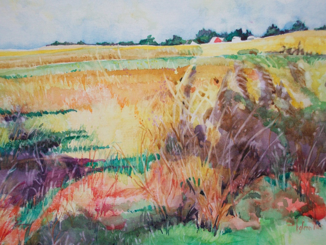
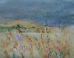
'Mother Color' is what Stephen Quiller calls the use of varying amounts of one color mixed into every other color in a painting.

This type of color scheme is what you are using if you are painting with pastels on a colored paper.  Every color in the painting picks up a small amount of the hue from the paper.  That's why the use of underpaintings are so effective.

But another way of achieving this, especially in watercolor - where you can't really use an underpainting - is to pick one color.  In the painting above I've chosen a cobalt blue.  Then for every other color I use in the scheme I've added anywhere from a touch to a large amount of cobalt.  So my yellows become more to the green side, my green is blued, my reds become more violet and the oranges of the fields become more siennas and nature toned.


And now - the movie!!   I saw an absolutely fantastic movie this weekend and it was right to the subject of something we've discussed in class.  Is tracing, gridding, projecting, i.e. copying legal?    Not that it answered the question but it did raise some very interesting questions as well provide an absolutely incredible story.    The name is Tim's Vermeer and it's at the Fleur.  If you get the chance, see it and we'll discuss it in class.   I will say I am in more awe than ever of Vermeer and of Tim.


0 Comments

Mood

3/9/2014

0 Comments

 
Picture
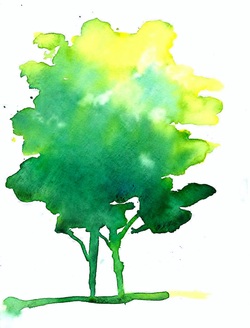
Colors that are related may also be used to express a mood in your painting.  Here the intensity of the yellow is strong, suggesting sun and light.  The mood of these colors seems to be joyful and suggestive of spring.

The basic colors are blue, yellow and green.  Plus the white background creates a lot of contrast.  While the yellow probably covers less space than the darker blue-green, the intensity of the yellow makes it the more dominant color.


Picture
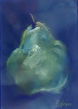
This pastel uses much the same combination but the intensity is lowered, suggesting a more somber mood. 

Here the colors are also blue, yellow and green.  But the dominance is heavily toward the blue spectrum. 


Picture
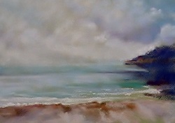
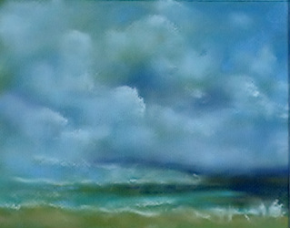
The blues and blue violets here suggest water vapor and the ocean spray on a cool day.  The scene isn't particularly gloomy or menacing but rather calm.

Picture
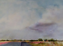
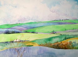
In this watercolor, the blues and violets contrast with sharper reds creating the effect of a storm approaching.  There are areas of sunlight playing against areas of darker clouds that create a tension in the painting.

In this painting the colors are stretched to include some that are outside the close relationship of blue-violet - enhancing the effect of disharmony.


0 Comments

Harmony

3/2/2014

0 Comments

 
Picture
For the first weeks of this class we've been looking at ways to provide color contrasts in our paintings.   Now we're going to explore some ways of providing harmony.

An analogous color scheme can be one of the most beautiful and calming ways of choosing color.  These are the colors that are next to each other on the color wheel.  Each of the colors is related to the others and have parts of the other colors in them.  For example, in the painting above, the green is the center position, with yellow and blue on each side.  The painting also includes a yellow green and a blue green as well as a darker blue.  So the green contains some of the blue and also some of the yellow in it.  The yellow contains some green and the blue is a cerulean, which contains some green (which contains some yellow). 

To find these colors draw a wedge of color extending through a primary, secondary and tertiary color.  These are the ones you will be using plus all the neutrals created by them and their complements. Plus the darker and lighter values of any of these.  You may also work with two primaries and include the secondary and tertiary that are between them.

When working with an analogous color scheme it is helpful to designate one color as dominate and use the others in a subordinate position.  The dominant color above would be blue with the green and yellow green in smaller areas.  It isn't necessary that the dominant color be the middle one.

One of the pitfalls of this color scheme is the difficulty of creating interest with such a limited palette or becoming overwhelmed by the use of too many colors that fall within the parameters of the scheme.  So, choose carefully by mapping your colors.  Include enough to create interest but not so many that it becomes too fragmented.


Using analogous colors is a good way of setting a mood.  In this pastel, I wanted to create the cool tranquility of the ocean mirrored in the clouds.  We'll discuss this more in the next blog.


0 Comments
    Picture

    Author

    Kathy Glenn
    Art Center

    Picture
    Picture

    Archives

    April 2018
    March 2018
    June 2017
    February 2017
    January 2017
    December 2016
    October 2016
    September 2016
    July 2016
    June 2016
    February 2016
    January 2016
    September 2015
    July 2015
    June 2015
    January 2015
    December 2014
    November 2014
    October 2014
    September 2014
    June 2014
    April 2014
    March 2014
    February 2014
    January 2014
    November 2013
    October 2013
    September 2013
    June 2013
    January 2013
    October 2012
    September 2012
    April 2012
    February 2012
    January 2012
    December 2011
    November 2011
    October 2011
    September 2011
    August 2011
    July 2011

    Picture

    Categories

    All

    RSS Feed

Proudly powered by Weebly