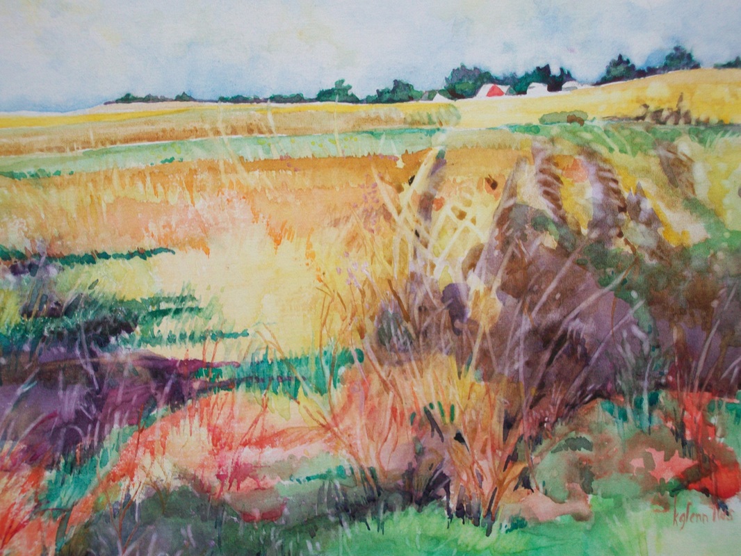
This week experimented with glazing - mixing color by adding other colors on top. Transparent watercolor is a particularly good medium for this type of painting. We quickly learned three things from this:
PATIENCE! If the artist doesn't allow the under color to dry completely there will not be glazing but mixing as in wet on wet. The colors will bleed.
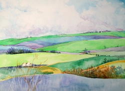
Its a good idea to know where you're going before you start. Painting in glazes starts with the lightest colors and adds glazing to make darker and darker colors.
It isn't as easy to get dark as it appears. Getting light and midrange color is fairly simple but adding the darker values - not so much.
A good example of an artist that uses LOTS of glazing is found at
www.pauljackson.com You might want to browse through some of his paintings to see how meticulous he is in adding glazing to build up his darks.
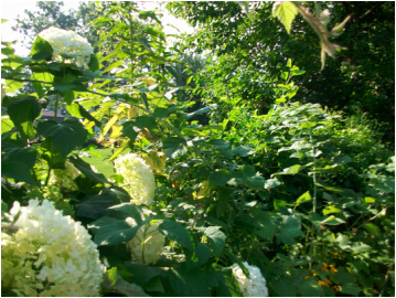
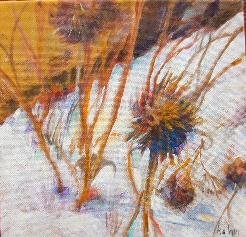
We also talked about values and the fact that colors are values. Some time when you don't have anything else to do, sit down and make a value chart across the top of a page of watercolor paper. Then fill in with as many of your colors or mixtures as you can under these. For example, under the lightest value you might paint pale yellow, pale pink, pale blue, etc. Remember that in watercolor you will be using water to make the colors lighter. Also remember that the colors at the top of the color wheel will be the lightest when full pigment is used. Under the darkest will be full strength purple and mixes of alizarin crimson and pthalo green.
When you have a good selection of color/values you will be able to substitute local color in an object with another color in the same value.
A good example of an artist who does this can be found at :
http://www.carol-carter.com/
Next week we'll be finishing up with watercolor and starting to work with acrylics. We'll be mixing opaque with transparent media in the manner of Stephen Quiller. If you'd like to take an early peek,
PATIENCE! If the artist doesn't allow the under color to dry completely there will not be glazing but mixing as in wet on wet. The colors will bleed.
Its a good idea to know where you're going before you start. Painting in glazes starts with the lightest colors and adds glazing to make darker and darker colors.
It isn't as easy to get dark as it appears. Getting light and midrange color is fairly simple but adding the darker values - not so much.
A good example of an artist that uses LOTS of glazing is found at
www.pauljackson.com You might want to browse through some of his paintings to see how meticulous he is in adding glazing to build up his darks.
We also talked about values and the fact that colors are values. Some time when you don't have anything else to do, sit down and make a value chart across the top of a page of watercolor paper. Then fill in with as many of your colors or mixtures as you can under these. For example, under the lightest value you might paint pale yellow, pale pink, pale blue, etc. Remember that in watercolor you will be using water to make the colors lighter. Also remember that the colors at the top of the color wheel will be the lightest when full pigment is used. Under the darkest will be full strength purple and mixes of alizarin crimson and pthalo green.
When you have a good selection of color/values you will be able to substitute local color in an object with another color in the same value.
A good example of an artist who does this can be found at :
http://www.carol-carter.com/
Next week we'll be finishing up with watercolor and starting to work with acrylics. We'll be mixing opaque with transparent media in the manner of Stephen Quiller. If you'd like to take an early peek,
 RSS Feed