For the last three weeks we have been looking at how the artist can use color to make statements more powerful by using contrasts.
These include the interplay of complementary color, warm and cools, color values, and intensity.
Let's just take one quick look at each of these::
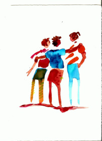
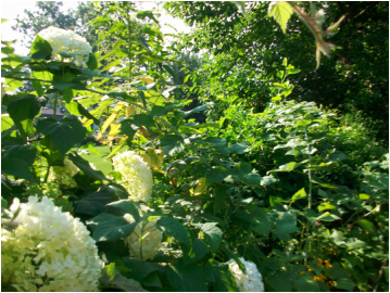
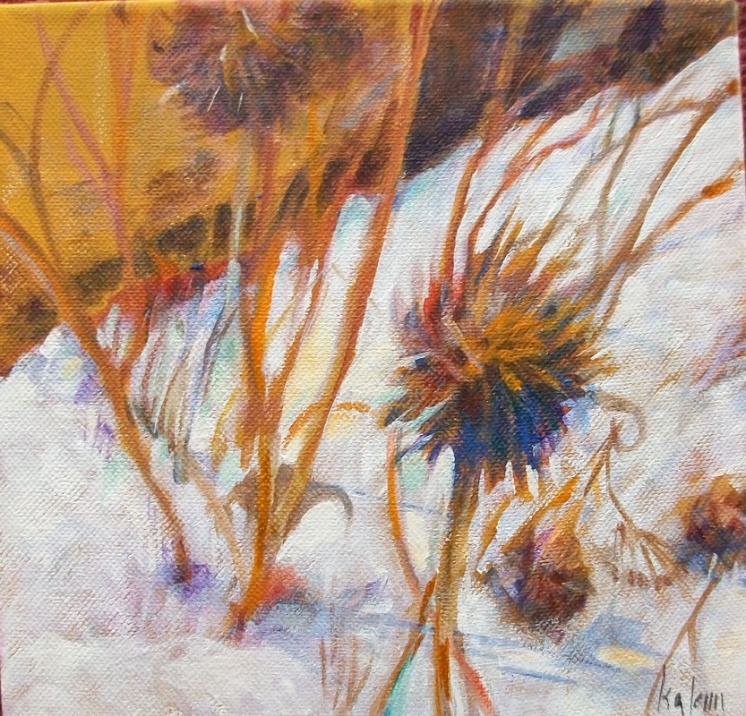
Complementary colors when placed next to each other cause the eye to center on the place where they meet. Using a great deal of one color and adding a small amount of the complement will help direct your viewer to the place you find most interesting.
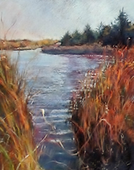
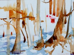
Warm and cool colors, when played against each other create interest within the picture. Once again, a large amount of one temperature with a contrasting area of its opposing temperature will draw the eye.
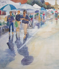
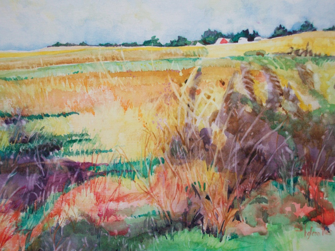
Color values contrast in the same way that black and white do.
An intense color - from the outside of the color wheel - will interplay with gray or neutralized colors to direct to the point of interest.
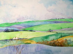
This week we will begin by creating a color scheme for your next painting. Color schemes help organize your work so it flows together and you don't become lost in your painting. Often we work adding color to our work and at some point become lost without knowing exactly where to go next. Having a scheme will help eliminate this.
This doesn't mean that you are locked into what you originally planned. But it will serve as a map that will help direct you to where you are going next.
These include the interplay of complementary color, warm and cools, color values, and intensity.
Let's just take one quick look at each of these::
Complementary colors when placed next to each other cause the eye to center on the place where they meet. Using a great deal of one color and adding a small amount of the complement will help direct your viewer to the place you find most interesting.
Warm and cool colors, when played against each other create interest within the picture. Once again, a large amount of one temperature with a contrasting area of its opposing temperature will draw the eye.
Color values contrast in the same way that black and white do.
An intense color - from the outside of the color wheel - will interplay with gray or neutralized colors to direct to the point of interest.
This week we will begin by creating a color scheme for your next painting. Color schemes help organize your work so it flows together and you don't become lost in your painting. Often we work adding color to our work and at some point become lost without knowing exactly where to go next. Having a scheme will help eliminate this.
This doesn't mean that you are locked into what you originally planned. But it will serve as a map that will help direct you to where you are going next.
 RSS Feed