This next week we'll be continuing with color temperature work. We'll be doing a short exercise using color to define form.
Then we will return to the challenges you have set for yourselves.
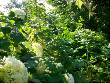
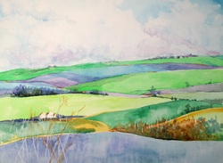
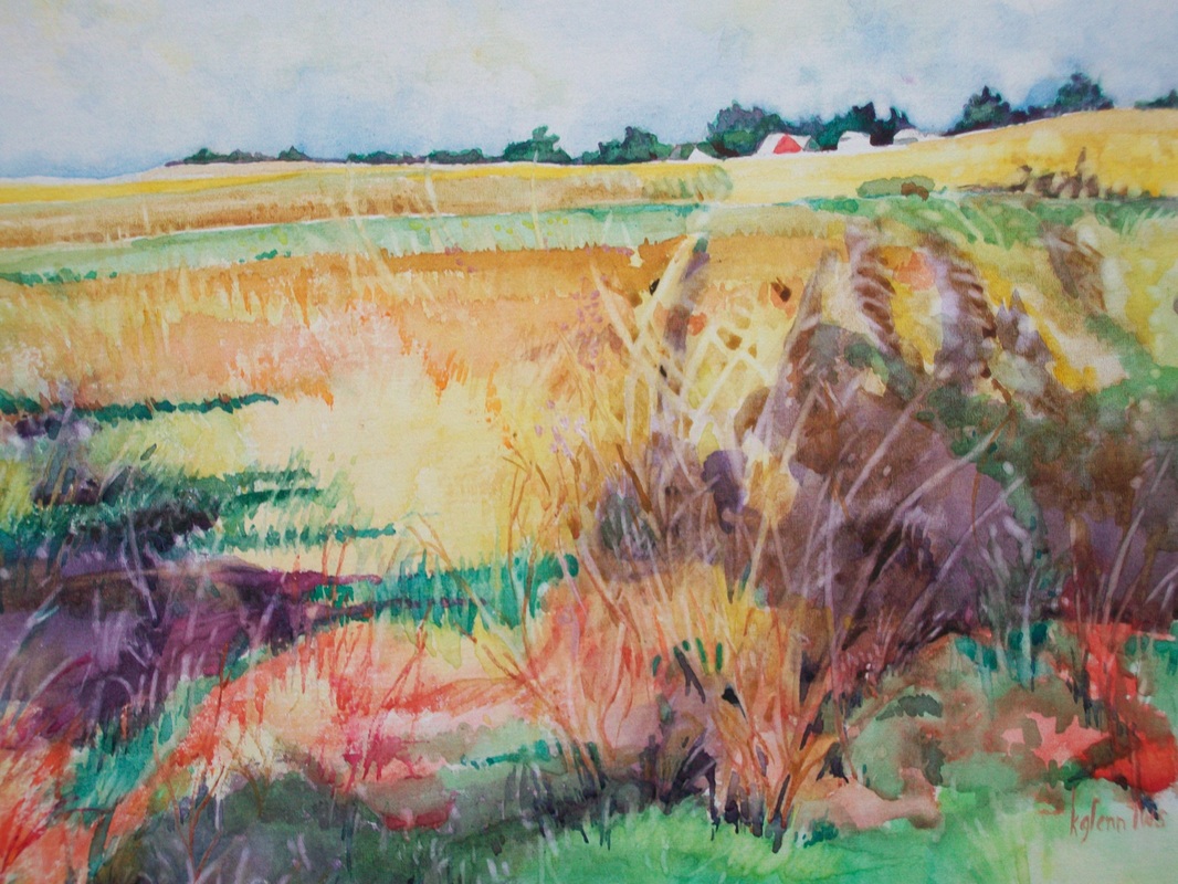
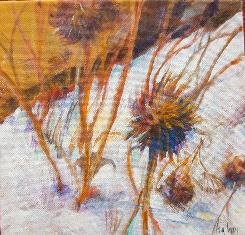
Last week we started to discuss color temperature. We looked at the color wheel and talked about Stephen Quiller's concepts.
This next week we'll be continuing with color temperature work. We'll be doing a short exercise using color to define form. Then we will return to the challenges you have set for yourselves.
2 Comments
This week's class was all about the use of intense color to provide a point of interest. We talked about using gray or neutral versions of color to surround the areas of interest that we highlighted by using intense and color.
To find a true intense color, look to the outside of the color wheel. All the colors on that outside ring are true color. As a complement or a split complement is added to the color it will begin to gray. Earth tone colors are variations of this phenomena. For example, ochre is a grayed yellow made by adding purple, blue purple, or red purple to the yellow. Burnt sienna is made by graying a red using its complement of green. Orange is grayed by blue - a combination that creates a really wonderful brown. The degree of neutral is determined by how much of the complement is added. As the complements near equal amounts in the mixture, the color becomes gray. Adding more of either side creates more of a brownish hue. I'm also including this week two picture I painted of the rocks in Sedona. They're done in watercolor on foamcore so they are very loose. This week we sampled three different media and are starting to get an idea of which one or ones we'd like to start using.
At the beginning of class next week we'll look at the still life we did. Then we'll do another quick painting using a photograph from home. We're going to talk about cropping and working with color to create more interest. |
AuthorKathy Glenn Archives
April 2018
Categories |