So back to two questions:
how am I going to show the viewer what is of interest in my painting?
what will make my painting more interesting?
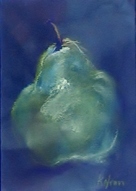
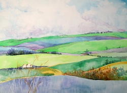
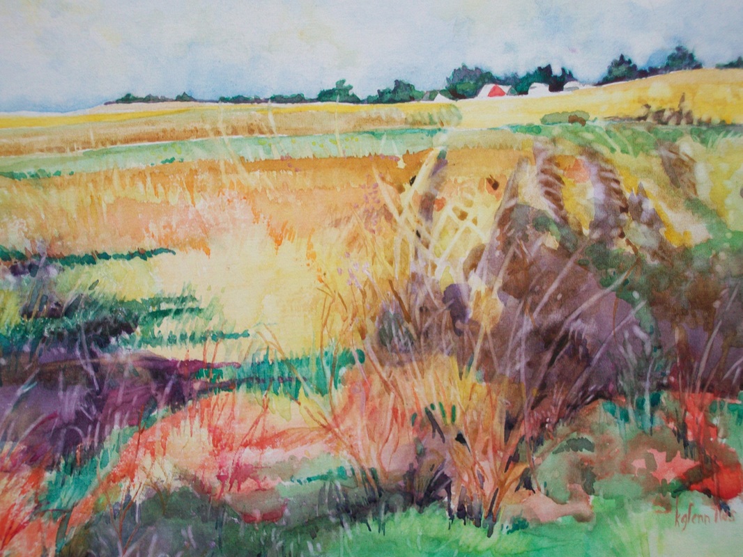
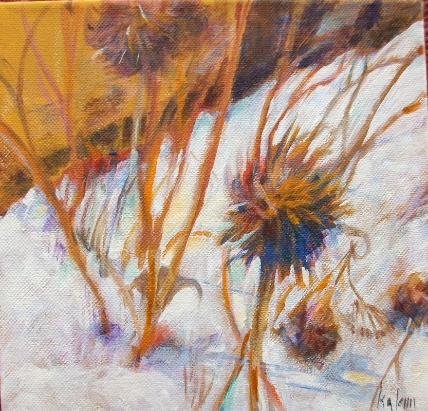
Just as we learned last time that the place where the darkest dark and the lightest light meet is the place where the eye will be directed in a painting; it can also be said the place where the most contrast occurs is the area of the most interest.
This means that we can show the viewer what we found to be the center of interest to us by manipulating contrasts.
Contrasts also add more excitement to a painting, just as color changes excite.
Colors contrast in value - darker and lighter - but what other ways can we show contrast. Here are a few:
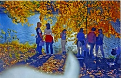
Complementary colors - those across the color wheel from each other.
Hard edges and soft edges - places of line and smudges.
Straight versus curves
Texture versus matte
Transparent next to opaque (ala Stephen Quiller)
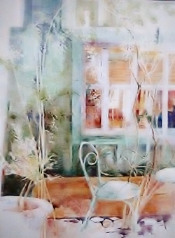
For the next two weeks we'll be planning and painting from your own photos, using a black and white sketch first, then a color map and finally the painting. It might also be useful to do some preliminary work on finding the contrasts we want to use.
how am I going to show the viewer what is of interest in my painting?
what will make my painting more interesting?
Just as we learned last time that the place where the darkest dark and the lightest light meet is the place where the eye will be directed in a painting; it can also be said the place where the most contrast occurs is the area of the most interest.
This means that we can show the viewer what we found to be the center of interest to us by manipulating contrasts.
Contrasts also add more excitement to a painting, just as color changes excite.
Colors contrast in value - darker and lighter - but what other ways can we show contrast. Here are a few:
Complementary colors - those across the color wheel from each other.
Hard edges and soft edges - places of line and smudges.
Straight versus curves
Texture versus matte
Transparent next to opaque (ala Stephen Quiller)
For the next two weeks we'll be planning and painting from your own photos, using a black and white sketch first, then a color map and finally the painting. It might also be useful to do some preliminary work on finding the contrasts we want to use.
 RSS Feed