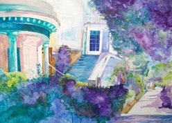
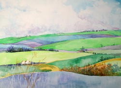
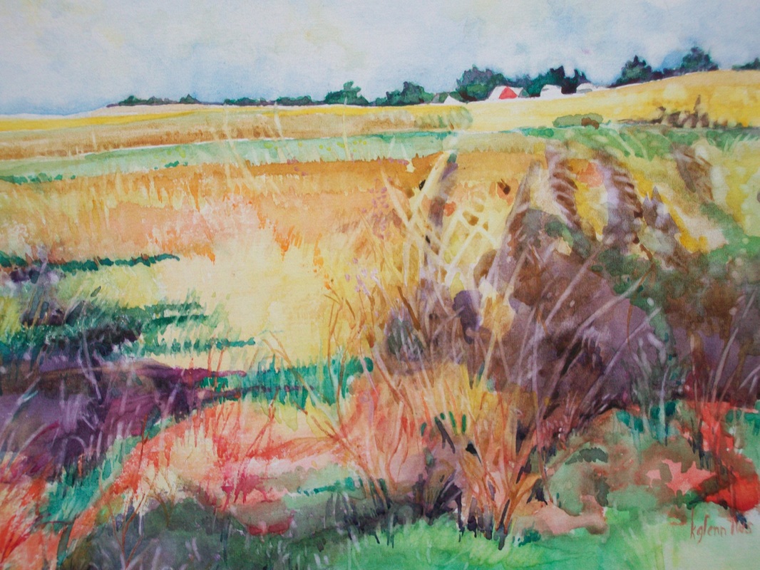
We are truly fortunate to be painting at this time. Not only do we not have to mix our own pigments but we are being offered fantastic new paints in every catalogue that comes out. Where once we might have worked with a primary triad of red, yellow and blue we now are offered such colors as quinacridone magenta, transparent yellow and cyan. This is a palette that is safe if you wish to have your artwork printed because the colors are nearly the same as the inks used by printers. Much more so than the traditional primary triad.
You'll find many new colors on manufacturer's charts at the art store or in their catalogues. You will recognize them by their jawbreaker names: anthraquinoid, thioindigo, indanthrone, and quinacridone.
A color index/ASTM Chart such as is found in Nita Leland's book, Confident Color is extremely helpful when you are choosing color.
But don't just take the chart at face value: it is a starting point for you to start your exploration of color. Try the paint for transparency, staining, and vibrancy. You work as an individual different from others and you are the best judge of what will work for you and your way of working.
 RSS Feed