You know about using composition to enhance your painting and to tell your viewer what has excited you about a subject. But there are also methods of creating better composition using color. Here are some suggestions:
Select a value key to emphasize a mood. Use light, bright color to create an optimistic painting or darker ones to show a somber, dramatic mood.
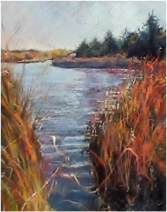
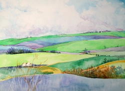
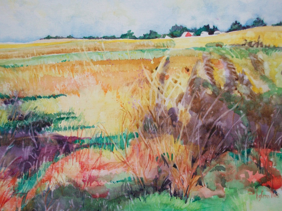
Arrange the sizes of color areas to give greatest importance to dominant color.
Use color pattern to move the eye through the painting
Rely on harmony to contribute serenity to a color scheme and use contrast to provide excitement.
Incorporate rhythm and repetition to make your colors dance.
From Nita Leland: " A gentleman in one of my workshops once told me, 'It could take you whole life to learn all this.' Well, maybe. But to a colorist, what could be more interesting? More challenging? More fun? What a great way to spend the rest of your life." And I totally agree. We're not going to learn everything we need to know about color in one class or even in one year. It is a lifelong pursuit and will change as you mature in your use of materials, subjects, and expression. And as your increase in excitement.
Remembering that unity is your goal in color design, let's talk about one way of capturing unity in color. Three quick ways of doing this in acrylic are:
Tone the canvas with a pale wash of a dominant color
Glaze the entire painting or specific areas with a light wash of a harmonious color
Use a 'mother color' approach - adding the dominant color to every other color you use in the painting.
Select a value key to emphasize a mood. Use light, bright color to create an optimistic painting or darker ones to show a somber, dramatic mood.
Arrange the sizes of color areas to give greatest importance to dominant color.
Use color pattern to move the eye through the painting
Rely on harmony to contribute serenity to a color scheme and use contrast to provide excitement.
Incorporate rhythm and repetition to make your colors dance.
From Nita Leland: " A gentleman in one of my workshops once told me, 'It could take you whole life to learn all this.' Well, maybe. But to a colorist, what could be more interesting? More challenging? More fun? What a great way to spend the rest of your life." And I totally agree. We're not going to learn everything we need to know about color in one class or even in one year. It is a lifelong pursuit and will change as you mature in your use of materials, subjects, and expression. And as your increase in excitement.
Remembering that unity is your goal in color design, let's talk about one way of capturing unity in color. Three quick ways of doing this in acrylic are:
Tone the canvas with a pale wash of a dominant color
Glaze the entire painting or specific areas with a light wash of a harmonious color
Use a 'mother color' approach - adding the dominant color to every other color you use in the painting.
 RSS Feed