For the first weeks of this class we've been looking at ways to provide color contrasts in our paintings. Now we're going to explore some ways of providing harmony.
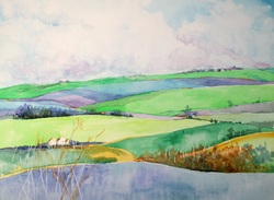
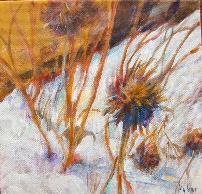
An analogous color scheme can be one of the most beautiful and calming ways of choosing color. These are the colors that are next to each other on the color wheel. Each of the colors is related to the others and have parts of the other colors in them. For example, in the painting above, the green is the center position, with yellow and blue on each side. The painting also includes a yellow green and a blue green as well as a darker blue. So the green contains some of the blue and also some of the yellow in it. The yellow contains some green and the blue is a cerulean, which contains some green (which contains some yellow).
To find these colors draw a wedge of color extending through a primary, secondary and tertiary color. These are the ones you will be using plus all the neutrals created by them and their complements. Plus the darker and lighter values of any of these. You may also work with two primaries and include the secondary and tertiary that are between them.
When working with an analogous color scheme it is helpful to designate one color as dominate and use the others in a subordinate position. The dominant color above would be blue with the green and yellow green in smaller areas. It isn't necessary that the dominant color be the middle one.
One of the pitfalls of this color scheme is the difficulty of creating interest with such a limited palette or becoming overwhelmed by the use of too many colors that fall within the parameters of the scheme. So, choose carefully by mapping your colors. Include enough to create interest but not so many that it becomes too fragmented.
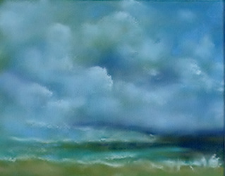
Using analogous colors is a good way of setting a mood. In this pastel, I wanted to create the cool tranquility of the ocean mirrored in the clouds. We'll discuss this more in the next blog.
An analogous color scheme can be one of the most beautiful and calming ways of choosing color. These are the colors that are next to each other on the color wheel. Each of the colors is related to the others and have parts of the other colors in them. For example, in the painting above, the green is the center position, with yellow and blue on each side. The painting also includes a yellow green and a blue green as well as a darker blue. So the green contains some of the blue and also some of the yellow in it. The yellow contains some green and the blue is a cerulean, which contains some green (which contains some yellow).
To find these colors draw a wedge of color extending through a primary, secondary and tertiary color. These are the ones you will be using plus all the neutrals created by them and their complements. Plus the darker and lighter values of any of these. You may also work with two primaries and include the secondary and tertiary that are between them.
When working with an analogous color scheme it is helpful to designate one color as dominate and use the others in a subordinate position. The dominant color above would be blue with the green and yellow green in smaller areas. It isn't necessary that the dominant color be the middle one.
One of the pitfalls of this color scheme is the difficulty of creating interest with such a limited palette or becoming overwhelmed by the use of too many colors that fall within the parameters of the scheme. So, choose carefully by mapping your colors. Include enough to create interest but not so many that it becomes too fragmented.
Using analogous colors is a good way of setting a mood. In this pastel, I wanted to create the cool tranquility of the ocean mirrored in the clouds. We'll discuss this more in the next blog.
 RSS Feed