Color has four properties. We've discussed the first - value.
The others are Hue, Intensity, and Temperature.
We can use these properties to interpret or make a statement about the photograph that we are using.
Let's look at Hue. This is the color name or its position on the spectrum - its wave length.
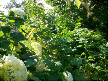
This morning I was walking on a forested path. Around me were trees and brush. The flowers that were there earlier are now gone. So, beyond the brown of the tree bark, I saw a sea of green. The forest's hue was green. But that green was made up of many varying shades of green.
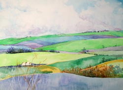
So if we are looking at a green area such as a lawn, we can use color to cue the viewer to what we are saying. For instance, we know that the length of that space is all the same green. That is the Local Color. But, because of shade, light, distance and other factors, our eye interprets the lawn as differing shades of green. In other words, the optical color.
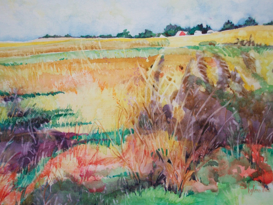
You, as the artist, have the opportunity to alter the hues to make your statement. To do that we'll be talking about optical light which uses temperature rather than local color.
The others are Hue, Intensity, and Temperature.
We can use these properties to interpret or make a statement about the photograph that we are using.
Let's look at Hue. This is the color name or its position on the spectrum - its wave length.
This morning I was walking on a forested path. Around me were trees and brush. The flowers that were there earlier are now gone. So, beyond the brown of the tree bark, I saw a sea of green. The forest's hue was green. But that green was made up of many varying shades of green.
So if we are looking at a green area such as a lawn, we can use color to cue the viewer to what we are saying. For instance, we know that the length of that space is all the same green. That is the Local Color. But, because of shade, light, distance and other factors, our eye interprets the lawn as differing shades of green. In other words, the optical color.
You, as the artist, have the opportunity to alter the hues to make your statement. To do that we'll be talking about optical light which uses temperature rather than local color.
 RSS Feed