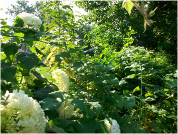
The term 'Intensity" refers to the brightness or dullness of a color.s
Color in its most intense form is found on the outside of the color wheel. When other colors are mixed with it, they tend to 'gray' or 'neutralize'. The further the addition is to the complementary color, the more it is dulled or neutralized.
One thing to be careful of is thinking that because a color is taken from a tube it will be in its most intense form. This isn't always the case. Some tube colors are actually a combination of colors.
A good exercise to find which of your colors are most intense is to take a sample of each tube of paint you own and place it on a color wheel you make. It will help you to see color as well as help you learn to handle your brush and the media. Exercises will go a much longer way to your growth as an artist than simply painting a picture.
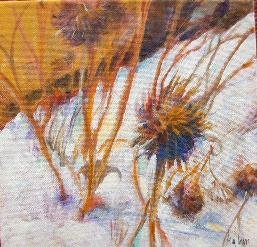
So how do you use intensity in a painting? Find the spot or area that you are most excited about - the point of interest. This is what you are saying about the photograph that you are working with - you artist's statement: "look at this! How interesting this is" This should be the most intense - some times even just a very small point of color will bring the viewer's eye to the spot.
When everything else in the painting is slightly to fully neutralized, that area will pop. The more neutral the surrounding area is, the bigger the impact.
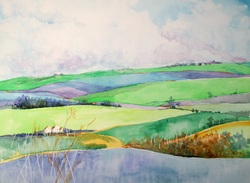
The question you will ask yourself as the artist is: do I want to make this area really stand out or just slightly speak to the viewer?
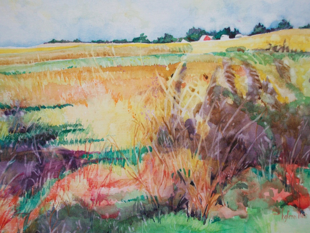
A quick word about too much intensity: You may wish to use all intense colors to make your statement. In this case you will have to use composition to zero in on the point of interest. And be sure you have a reason for high intensity beyond just liking the colors.
Color in its most intense form is found on the outside of the color wheel. When other colors are mixed with it, they tend to 'gray' or 'neutralize'. The further the addition is to the complementary color, the more it is dulled or neutralized.
One thing to be careful of is thinking that because a color is taken from a tube it will be in its most intense form. This isn't always the case. Some tube colors are actually a combination of colors.
A good exercise to find which of your colors are most intense is to take a sample of each tube of paint you own and place it on a color wheel you make. It will help you to see color as well as help you learn to handle your brush and the media. Exercises will go a much longer way to your growth as an artist than simply painting a picture.
So how do you use intensity in a painting? Find the spot or area that you are most excited about - the point of interest. This is what you are saying about the photograph that you are working with - you artist's statement: "look at this! How interesting this is" This should be the most intense - some times even just a very small point of color will bring the viewer's eye to the spot.
When everything else in the painting is slightly to fully neutralized, that area will pop. The more neutral the surrounding area is, the bigger the impact.
The question you will ask yourself as the artist is: do I want to make this area really stand out or just slightly speak to the viewer?
A quick word about too much intensity: You may wish to use all intense colors to make your statement. In this case you will have to use composition to zero in on the point of interest. And be sure you have a reason for high intensity beyond just liking the colors.
 RSS Feed