Week One:
This week we are going to discuss two different things: one the use of the medium of oil and the other the use of color to define space or dimension.
We are going to start with color as there are some in the class who will be working in other media and this will allow them to get right to work while the rest of us explore oils.
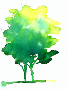
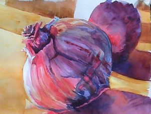
As an artist the selection of color goes far beyond what is visible as we look at a subject. For example, we might see a green vase on a blue cloth with a window in the background and billowing white curtains. Now we know that the vase is green throughout with the exception of any ornamentation. But how do we show that the vase has a form?
Well, we can use value – like a charcoal rendering – with the darker value suggesting shadow and the lighter values highlighting the illuminated areas.
But color can be used much more effectively to construct the form of the vase.
First we know that shadows are cool. Think of sitting under a tree on a hot summer day. And we know that areas touched by the sun are warm. So we need to think warm to show illumination and cool to show shadow.
But we also know that shadowed areas are darker while lighted areas are lighter in value.
To quote Carol Carter: “Value does the work, color gets the credit.”
So we need to establish where the values go on the vase and then we have another decision to make: what color will we be using to show those values.
You, as the artist, get to choose from any of the colors on your palette. Some artists arrange their palettes with warms together and cools together in another place. That way, they can dip into a warm light color when it is needed and a dark cool one for shadowing.
Another way I would suggest is to have samples of colors on a card. Label them so you will know how you mixed the color and have it at hand. If you have not done so already, this would be a good exercise before you begin to paint. If you are comfortable with color, you might try using colors as they relate to each other rather in temperature rather than just which side of the color wheel they are on.
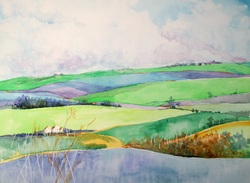
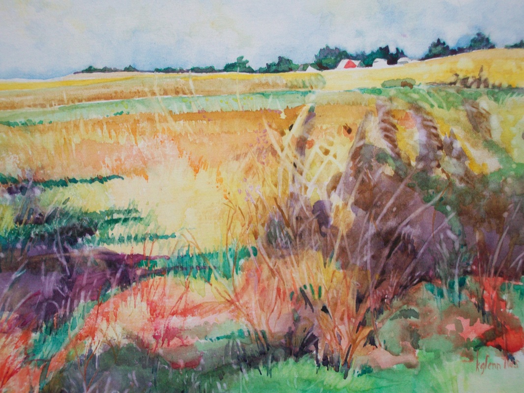
In the same way, color in a landscape is influenced by distance in much the same way that color is influenced by shape. Shadows are cool and dark while lighted areas are warm and light.
Once you know what colors you will be using pick either a group of three objects such as pears or a simple landscape with trees and a building. Make a quick value sketch. Then paint the predominant color adding shadowing and lights. It doesn’t matter which cool color you use to show shadows as long as it is dark. Likewise, it doesn’t matter which warm color you choose to show lighted areas as long as it is light. These are choices you make as an artist to express what you feel about the subject you are painting.
This week we are going to discuss two different things: one the use of the medium of oil and the other the use of color to define space or dimension.
We are going to start with color as there are some in the class who will be working in other media and this will allow them to get right to work while the rest of us explore oils.
As an artist the selection of color goes far beyond what is visible as we look at a subject. For example, we might see a green vase on a blue cloth with a window in the background and billowing white curtains. Now we know that the vase is green throughout with the exception of any ornamentation. But how do we show that the vase has a form?
Well, we can use value – like a charcoal rendering – with the darker value suggesting shadow and the lighter values highlighting the illuminated areas.
But color can be used much more effectively to construct the form of the vase.
First we know that shadows are cool. Think of sitting under a tree on a hot summer day. And we know that areas touched by the sun are warm. So we need to think warm to show illumination and cool to show shadow.
But we also know that shadowed areas are darker while lighted areas are lighter in value.
To quote Carol Carter: “Value does the work, color gets the credit.”
So we need to establish where the values go on the vase and then we have another decision to make: what color will we be using to show those values.
You, as the artist, get to choose from any of the colors on your palette. Some artists arrange their palettes with warms together and cools together in another place. That way, they can dip into a warm light color when it is needed and a dark cool one for shadowing.
Another way I would suggest is to have samples of colors on a card. Label them so you will know how you mixed the color and have it at hand. If you have not done so already, this would be a good exercise before you begin to paint. If you are comfortable with color, you might try using colors as they relate to each other rather in temperature rather than just which side of the color wheel they are on.
In the same way, color in a landscape is influenced by distance in much the same way that color is influenced by shape. Shadows are cool and dark while lighted areas are warm and light.
Once you know what colors you will be using pick either a group of three objects such as pears or a simple landscape with trees and a building. Make a quick value sketch. Then paint the predominant color adding shadowing and lights. It doesn’t matter which cool color you use to show shadows as long as it is dark. Likewise, it doesn’t matter which warm color you choose to show lighted areas as long as it is light. These are choices you make as an artist to express what you feel about the subject you are painting.
Working With Oils:
Before we start here are some websites you might like to use to give you further information:
http://painting.about.com/cs/oils/a/tips_oils.htm
http://ezinearticles.com/?Oil-Painting-For-Beginners---How-to-Get-Started&id=3672118
http://www.jerrysartarama.com/art-supply-brands/soho-urban-artist.htm
Oils often seem daunting to the beginner. One, they seem to be messy! They're hard to clean up! What is this thing about fat over lean?
Actually it is not all that difficult. So we're going to start with a small canvas and work through a painting.
While there are many ways of using oils, style wise, there are several underlying principles you might be aware of:
You'll need to have something to mix on. I use something disposable like a paper plate, and you'll need plenty of paper towels.
A bar of soap or a brush cleaning soap will help with cleaning your brushes.
Oils do not dry quickly. Understanding the properties of how they dry is helpful in making everything go smoothly. There is a wrong and right way to apply the oils.
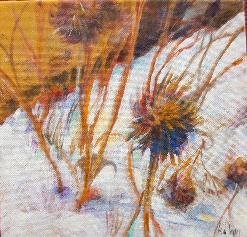
There still are many different ways to work with oils, so I'm going to share the way I paint in the medium.
Perhaps my most natural media is watercolor but I do love working in oils. So the style in which I approach oils is from that of a watercolorist, using lots of glazes. I like to build up the color and layers on the canvas.
So this week we're just going to go for it and paint! And have a good time doing it! No worries!
Before we start here are some websites you might like to use to give you further information:
http://painting.about.com/cs/oils/a/tips_oils.htm
http://ezinearticles.com/?Oil-Painting-For-Beginners---How-to-Get-Started&id=3672118
http://www.jerrysartarama.com/art-supply-brands/soho-urban-artist.htm
Oils often seem daunting to the beginner. One, they seem to be messy! They're hard to clean up! What is this thing about fat over lean?
Actually it is not all that difficult. So we're going to start with a small canvas and work through a painting.
While there are many ways of using oils, style wise, there are several underlying principles you might be aware of:
You'll need to have something to mix on. I use something disposable like a paper plate, and you'll need plenty of paper towels.
A bar of soap or a brush cleaning soap will help with cleaning your brushes.
Oils do not dry quickly. Understanding the properties of how they dry is helpful in making everything go smoothly. There is a wrong and right way to apply the oils.
There still are many different ways to work with oils, so I'm going to share the way I paint in the medium.
Perhaps my most natural media is watercolor but I do love working in oils. So the style in which I approach oils is from that of a watercolorist, using lots of glazes. I like to build up the color and layers on the canvas.
So this week we're just going to go for it and paint! And have a good time doing it! No worries!
 RSS Feed