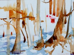
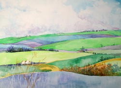
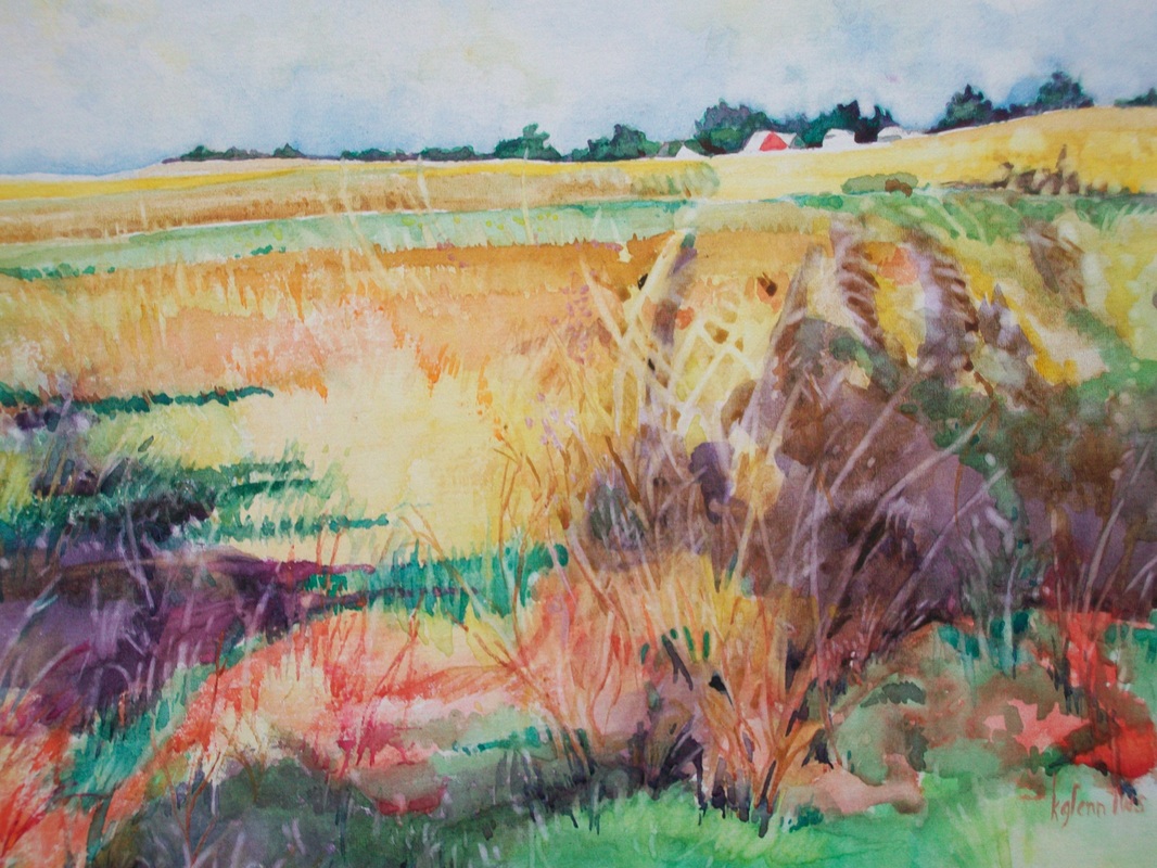
So I'm hoping at this point you have discovered that a color has a 'family' of an endless number of 'colors'.
When we look at a color wheel, we can see that one color - in this case let's use Blue - has a wedge of colors that we can still call 'Blue'. It reminds me of when I was a child, one of my greatest possessions was a box of 64 crayons. At that time there weren't creative names for the color but a concrete representation of what the color really was. Actually it was an early education in color theory. There was the color Blue, then Blue Blue violet, then Blue Violet, then on the other side , Blue Green and Blue blue green. In other words, the color Blue extended from where the Blue met the Violet on one side and where it intersected with the color Green on the other.
But the color family also extends as far as to the point where it meets its complement. In blue's case - orange. And when there is an equal amount of blue and an equal amount of orange there should be 'gray'. I say, should be, because there are variations in pigment, brands, and so on. But any true color plus its true complement should produce gray. Also there are steps of color between the true hue and central gray - called neutrals and looking much like brown or earth tones.
Finally any of the colors in the wedge may be changed by adding either black or white, making them darker or lighter. In the case of watercolor - the light would be either more water or gauche. And the dark something like a neutral tint or addition of a darker color.
That said, there is a wedge created of colors that all could be labeled 'blue'. We'll be talking more of why that is important in class. But it gives the artist a good tool to use in choosing color to express themselves.
 RSS Feed