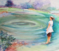
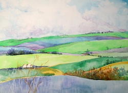
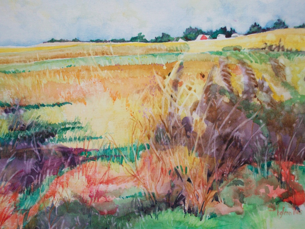
 labryinth
 This week we explored the properties of watercolor. These are often listed in catalogues for the tubes of paint they carry. Almost all of them we can discover by ourselves through experimentation.
1. Transparency: Some brands and colors are capable of being layered one on top of another to alter the color underneath. This property of watercolor is what gives it such a sheer, shimmering quality. While the manufacturer will tell you the transparency of a color, it is best to test this for yourself before trying to layer or 'glaze' colors. Other colors are semi-transparent or even opaque. The opaque paints completely mask the color underneath. There are places for all of these in your work but you, as the artist, must know which will achieve the effect you desire. The best way of doing this is to run strips of color on top of others to test how they will react.
2. Lightfastedness: For this property you will probably have to take the manufacturer's word. This is how well the paint will hold its color vs. how quickly it will fade.
3. Permanent (Staining) vs. Ability to Lift: Some colors - most of the Phalos (as well as the Winsor greens and blue), and Alizarin Crimson will grab the paper and stain. This can be beneficial or a disaster. Other colors like the Quins and Permanent Rose will lift beautifully from the paper. There are several reasons you would like to have this happen so it is best to know exactly how each of the paints in your palette will behave. You can test this easily by making a slash of color, then try to remove the color with water. Some colors will even lift after they are dry, so test some after they are completely dry.
4. Granulation: Some paints will go on the paper with a smooth finish while others will pull the color into textures. This is called 'granulation'. Again you can test paints by making swatches of color and watching how the paint acts. Some colors, like cerulean blue and manganese will granulate. Other paints are actually manufactured to enhance the granulation process. Daniel Smith has a great line of these granulating colors.
 RSS Feed