What are warm and cool colors?
On the color wheel the dividing point is a line from red violet to yellow green. The colors on the reddish side are warm and the colors on the greenish side are cool Sometimes this is expressed by saying that warm colors are found in fire while cool are found in water and sky. Red violet and Yellow Green can be either warm or cool dependent upon the colors around them. from Stephen Quiller.
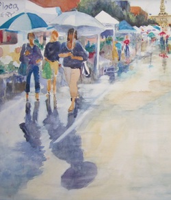
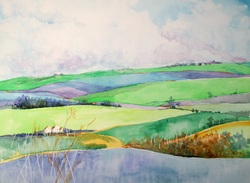
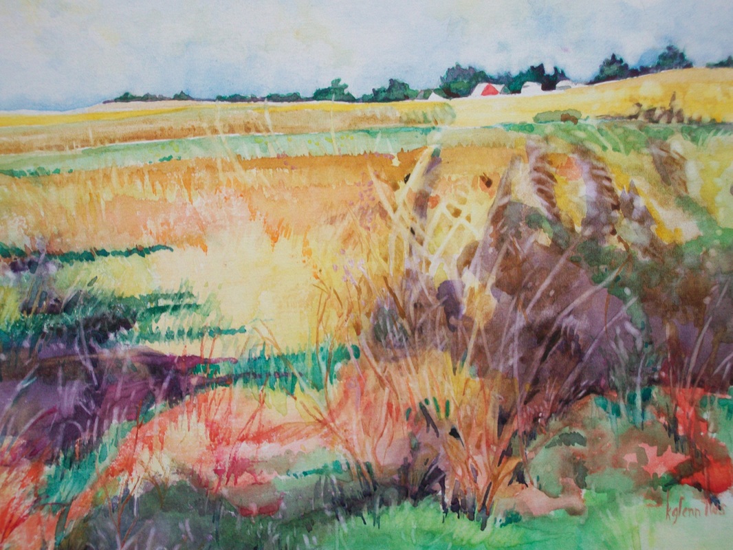
Warm colors advance and cool colors recede. This allows the artist to express depth by cooling the colors as the landscape moves away from the eye.
Warm and cool may also be used to show form. Colors that are nearer the source of light - assuming that light is akin to the sun - are lighter but also warmer while colors in shadow are not only darker but also cooler. Manipulating the color of an object will help you express the form of an object.
Then, just to make things more interesting, each color can be either warm or cool dependent upon the colors next to it. So a purple which is normally classed as a cool color is warmer than a phalo blue which is warmer than a turquoise blue. Likewise, a yellow is warm but when placed next to an orange, it is cooler. So colors are relative according to their neighbors.
A good exercise to train your eye is to take all the reds you have on your palette and make swatches. or you can try mixing several reds. Cut these out and arrange them according to which are warmer and which cooler.
And if we want to make things even more fun - we can substitute colors with others that are cooler or warmer and in the same value. For example we might add a pale peach on a green pear to show where the sun touches it. Or a dark turquoise on areas in shadow.
There are two ways we might use this information to make our paintings more effective.
We've seen how contrasts help make our work more interesting to the viewer. So the artist may dance between warm and cool to create contrast, establish rhythm, and show point of interest.
Or the artist may choose either warm or cool colors to express a mood. Generally cool colors are more peaceful while warm are more exciting.
Another good exercise is to make two small paintings of the same object. Paint one in all cool colors and the either in all warm. Compare the two to see the difference in mood. Then paint the subject using both. Which is more effective to what you are trying to tell the viewer?
The more you work with this concept the more your eye will begin to see the way nature uses color temperature and the better able you will be to see the difference in color swatches and be able to make selections from them.
On the color wheel the dividing point is a line from red violet to yellow green. The colors on the reddish side are warm and the colors on the greenish side are cool Sometimes this is expressed by saying that warm colors are found in fire while cool are found in water and sky. Red violet and Yellow Green can be either warm or cool dependent upon the colors around them. from Stephen Quiller.
Warm colors advance and cool colors recede. This allows the artist to express depth by cooling the colors as the landscape moves away from the eye.
Warm and cool may also be used to show form. Colors that are nearer the source of light - assuming that light is akin to the sun - are lighter but also warmer while colors in shadow are not only darker but also cooler. Manipulating the color of an object will help you express the form of an object.
Then, just to make things more interesting, each color can be either warm or cool dependent upon the colors next to it. So a purple which is normally classed as a cool color is warmer than a phalo blue which is warmer than a turquoise blue. Likewise, a yellow is warm but when placed next to an orange, it is cooler. So colors are relative according to their neighbors.
A good exercise to train your eye is to take all the reds you have on your palette and make swatches. or you can try mixing several reds. Cut these out and arrange them according to which are warmer and which cooler.
And if we want to make things even more fun - we can substitute colors with others that are cooler or warmer and in the same value. For example we might add a pale peach on a green pear to show where the sun touches it. Or a dark turquoise on areas in shadow.
There are two ways we might use this information to make our paintings more effective.
We've seen how contrasts help make our work more interesting to the viewer. So the artist may dance between warm and cool to create contrast, establish rhythm, and show point of interest.
Or the artist may choose either warm or cool colors to express a mood. Generally cool colors are more peaceful while warm are more exciting.
Another good exercise is to make two small paintings of the same object. Paint one in all cool colors and the either in all warm. Compare the two to see the difference in mood. Then paint the subject using both. Which is more effective to what you are trying to tell the viewer?
The more you work with this concept the more your eye will begin to see the way nature uses color temperature and the better able you will be to see the difference in color swatches and be able to make selections from them.
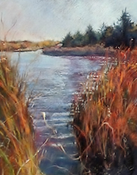
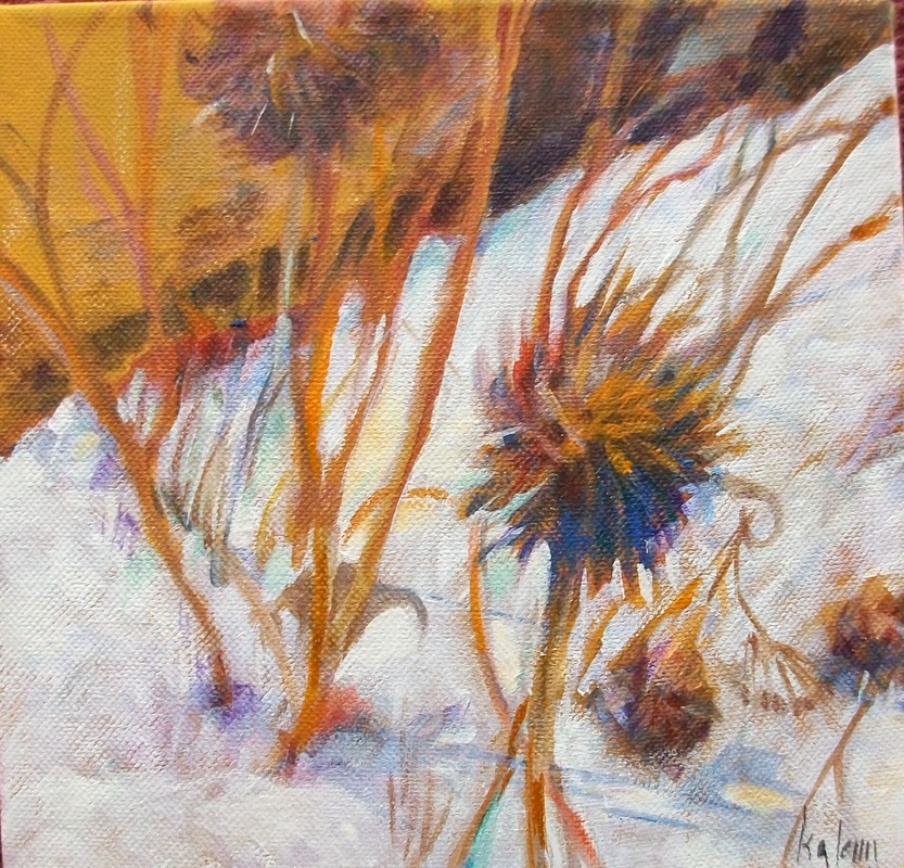
Somerset Autumn pastel on paper
 RSS Feed